
Because of this, many people are looking to their existing homes to see how they can better live in the space that they have, at least for a little longer. Space is usually an issue, especially for people who are still in a starter home. Additions can bring a lot of extra space and functionality to a smaller home and will add resale value when the time is finally right to go on the market.
However, we want to caution you to beware of a common pitfall when putting on an addition. Many times people are trying to do it as inexpensively as possible, which is understandable. But don't cut costs so much that you put on an ugly addition that doesn't jive with the style of your home. This will hurt your future resale price and may even lose you money that you were hoping to gain.
We're going to show you some examples of additions that do not look right with the rest of the existing home so that you can see what we're talking about.
Ugly Additions
 |
| Source: landmarkservices.com |
Here is an example of an addition that isn't proportional to the rest of the home. This little box added on is not at an appropriate scale to the rest of the house. Additionally, the roof line doesn't match and they've added a second front entrance which confuses people visiting the home.
 |
| Source: fix-it.co.nz |
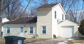
Hmm, can you spot what went wrong here? Just about everything. It looks as though there was an original small house with an original detached one-car garage and they decided to connect the two and didn't know when to stop. If they were going to add a second story, they should have done it for the entire length of the house.
 |
| Source: flickr.com |
 |
| Source: searshomes.org |
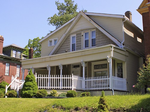
While this addition isn't as objectionable as the ones above, it still could have been vastly improved. The addition should have been stepped back a bit from the front of the original house rather than being a continuous wall. They should not have extended the porch the entire length of the house. It also should have been kept a bit less wide than the original house so that it looked like a wing of the original house. The way it is, the house is unbalanced with your eye wanting to focus towards the right (the original house) but then being distracted by the space on the left.
 |
| Source: city-data.com |
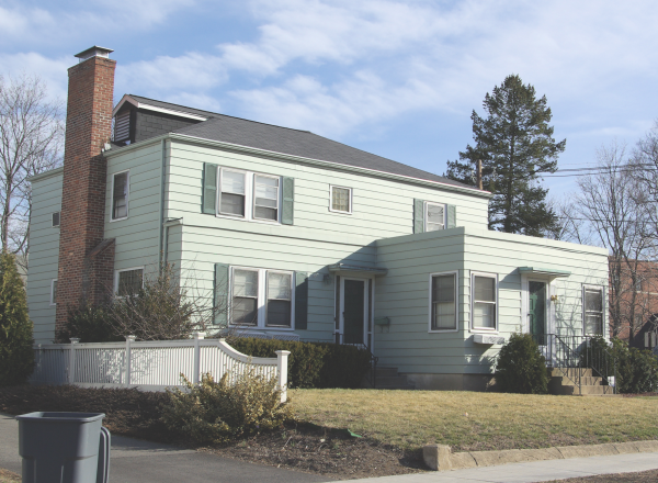
Oh my. So many mis-steps here. It looks like the original home was a split level. The first addition which includes a new entry and new garage with a second story is bigger than the original house! Then to make matters worse, they added that gargantuan garage. Please just build a separate pole barn, folks. Don't be these people.
Seamless Additions
We've shown you what not to do. Now take a look at some fabulous additions. When an addition is done correctly, you shouldn't even be able to tell that the home was ever added on to.
We've shown you what not to do. Now take a look at some fabulous additions. When an addition is done correctly, you shouldn't even be able to tell that the home was ever added on to.
 |
| Source: mjwhelan.com |
This home took over the space of the old garage to be living space, and added a new 3-car garage with a reconfigured driveway towards the front. They also changed the roof lines of both the existing house and the addition so that the home looks like it was built as one unit.
 |
| Source: mjwhelan.com |
This addition looks great because the addition has all the same architectural details of the original house. The roof line is the same pitch, the dormer and the three windows on the addition mimic those on the original, and the garage was not shoved up front but kept back as the original one was.
 |
| Source: 3ddesignremodel.com |
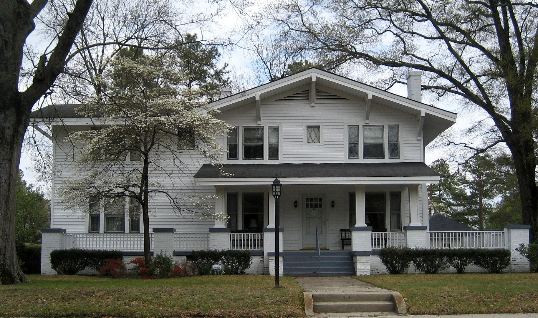
This home's addition looks like a wing of the original house by keeping the roof line the same and stepping the front face of the addition back from the front face of the house. They also did not leave the front door in place but closed it off when they added the new entry.
 |
| Source: pinterest.com |
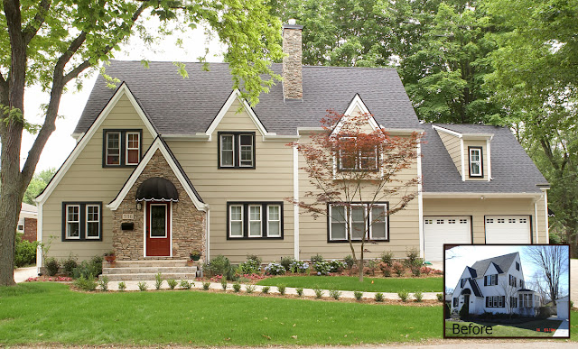
Here is an example of fixing a former ugly addition. The roof line was changed over the entry and the garage to tie in the front bump out. They also added a window on the 2nd story of the bump out as well as added a little roof over the lower level window. They also changed the orientation of the garage to be a side entry instead of a front facing entry. The redone home looks like it was meant to be this way.
 |
| Source: gardnerfox.com |
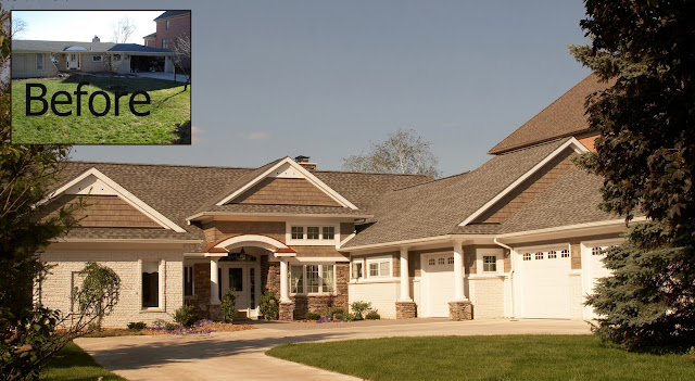
This beautiful home was done exactly right. The actually tore down the original right wing, and replaced it with a 2-story addition with a new attached garage.
If you're thinking of adding an addition meet with your Realtor to determine if your house will still fit in with your neighborhood after the addition. Then meet with an architect to be sure that your addition actually enhances the look of your home rather than being a tacked on eyesore.
Source: Michelle Schwake for Stafford Family Realtors
No comments:
Post a Comment